Friday 29 April 2016

Website Problems

Since I have been creating my website, I have been faced with many difficulties.  When I began creating my website, I had a clear design idea that I wanted to stick by, however I am using Adobe Muse and some things that I would like to achieve do not seem to be possible.

MISMATCH BANNER LAYOUT
I was really happy with the logo that I had previously decided on, however having made it into a banner for my website I no longer think it fits with the theme of my magazine.  As a square logo I think that the design works well, though when it is translated into a banner and the square is so small in the middle, you lose the effect.  I also feel that it doesn't look as professional as I had hoped, which I think could be to do with the pink/purple coloured background.
Current Website Homepage
I also have grown to dislike the font that features in the logo, as when I have started to write features to be added to the website it does not look professional.  Therefore I think that I need to re-work the logo and banner so that they fit with the concept of my magazine and make it look more professional.


MENU TROUBLES
I wanted a banner with my logo across the top with a horizontal menu underneath.  When the viewer scrolls down the page, I want the menu to scroll to the top and then stay there as the rest of the page scrolls, so that the menu is always accessible for the reader, similar to the Get the Gloss website (see below).


However after googling for hours and seeking John's help, it seems that this is not possible, which is frustrating as I really wanted it to work.  I still want my menu to appear and stay at the top of the page when the reader scrolls through the website, so I have come up with some possible solutions to this problem:
      1) Pin the banner as well as the menu at the top of the page so that they both stay there when the reader scrolls.
      2) Change the design of my website.
Because I do not want to have a banner that scrolls with the page as well, and because the current banner design that I have is not working the way that I had envisioned, I think that my best option is to adapt the design of my website.

Wednesday 27 April 2016

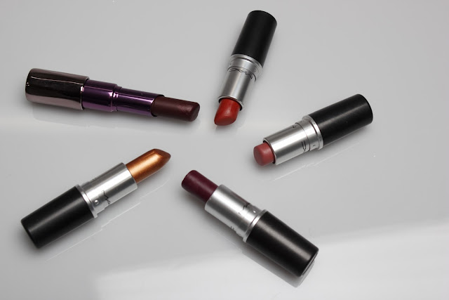
Still Life - Product Photoshoot 2


I am happy with how today's still life photoshoot went, although the images are not perfect.  I decided to do a second one because last time I focused a lot on the textures of the products rather than the products themselves.  Therefore I thought that it would be a good idea to conduct another still life shoot where I could focus on the products and create visuals of a selection of products that could work together for a make-up look.  I am unsure yet if I will use this idea within my magazine, but I wanted to have the images there in case I did decide that I wanted to include something like that.

I have found still life shooting very difficult, as it is a concept that I had never done before until this project.  I found it very difficult to get the lighting right, because I wanted the products laying flat on the surface but when I leant over with the camera to get a flat shot, a shadow was created in most images, which is something that I do not want featured on my website.  It was also difficult to get the brightness of the light right, as it reflected off of some of the products with metal areas.  In an attempt to overcome these difficulties, I adjusted the brightness of the flash and the shutter speed, however this then made the images too dark.  I also tried standing on a chair to be able to get a good flat view of the table, however this still caused some shadowing.

To correct these errors, I will use photoshop in post-production to bring up the brightness a bit and tone down the contrast to try and get rid of the shadows.  It's annoying because I like the style of the images and the ways that I arranged the products, but the lighting and shadows let the overall image down.  Therefore I am hoping to rectify this.

Thursday 21 April 2016

Research - Skincare & Clinique

Having seen Elizabeth on Tuesday and talked about skincare regimes, it was suggested that I look into the history of Clinique and their skincare. Revolutionising skincare and the beauty industry in the late 60s, Clinique began when Dr Norman Orentreich, a New York dermatologist, expressed that he believed "great skin can be created".  At the time, skincare was not something that many blinked an eyelid at, as it was believed that you inherited good skin.  1968 saw the release of the renowned 3-Step Skin Care System - a daily cleansing, exfoliating and moisturising routine.
Clinique revolutionised the way that we look after our skin, and now many other companies have duped their own versions of skincare products.  I believe that skincare is becoming more important in everyone's daily routines, men and women alike are purchasing different products to try and reduce their ageing, before they properly begin to age.  It's become regimented within our social system, however it's still evolving and changing.
Within the skincare article, I will explore the ideas from the research above and look at how our skincare systems are evolving with new brands being welcomed into the industry.  I think that skincare is a really interesting topic and one that a lot of people overlook if they aren't used to it or do not have a routine themselves.  Hopefully this is something that I can communicate to my readers.


CLINIQUE, N.D. Our History [online] [viewed 21st April 2016]. Available from: http://www.clinique.jobs/clinique/our-history.html

Wednesday 20 April 2016

Revised Website Designs

Since my mid-point presentation, I have been rethinking my website layout and how I want it to look.  As the lecturers thought that I should drop the fashion feature, I have, and I have also taken into consideration their points made about the menu bar and how many tabs it should have.  I have also decided that I no longer want the 'News Feed' section on the right hand side, as I realised that it would not work well for a start-up magazine.  Whereas if the magazine had been running for longer than three months and if it had more content than I plan to have finished for the hand-in, then it would work as a really nice feature to aid the accessibility of the magazine's features.

HOMEPAGE
I want the online magazine to land on the homepage, where the reader will be greeted with a slideshow of images that will take them to a feature within the website when clicked on.  Also featured on the homepage will be a written piece about the overview of the upcoming trends for the Autumn/Winter season.

BEAUTY/HAIR HOMEPAGE
The Beauty and Hair homepage's will be similar to the main homepage, with an arrangement of images that relate to the different features under each section.

FEATURE PAGES
Each feature page will be arranged differently, but here I have drawn a general outline with what sort of things will be featured in each section.

ABOUT PAGE
As a magazine it is important to have an About page so that your readers can learn more about you and what you aim to achieve and give to your readers through your magazine.

CONTACT PAGE
Again, it is important to have a mode of contact so that your readers can contact you about any enquiries that they may have.

Overall, I think that the revised designs will improve the layout of the magazine's website.  Key features for my updated website design include the accessibility of my menu bar - I want the menu to scroll and stick at the top of the page as the reader scrolls through the site.  This is important because I think it will bring the whole website together and make all of the other features more accessible, as they will not have to scroll back up again to navigate elsewhere on the site.  Hopefully I can make this work with John's help.

Tuesday 19 April 2016

Tutorial with Elizabeth

In today's tutorial with Elizabeth, we went through the work that I have produced so far.  I showed her my photoshoots that I had done since I last saw her, which she was pleased with, and we discussed more ideas within forecasting.

Having shown her my milk bath photoshoot for skincare, we discussed the idea of 'routine' and how we create our own schedules to stick by.  We talked about Clinique and Dr Orentreich, who is someone that I need to research into to progress in my project.  Elizabeth also showed me some forecasting booklets that she had, and we decided that I should do another still life photoshoot to create a colour palette with ordinary day-to-day objects, as well as having a colour palette with make-up products.  Retail and Instagram were also discussed as extra possible areas that I could look into for my magazine, as Instagram is becoming more and more popular and a lot of brands have started to sell products through their accounts.  With regards to Instagram, there are a lot of American 'natural vegan beauty' accounts that have started their own businesses through the social network, which could be another point of interest.

I am happy with the areas that Elizabeth and I discussed in my meeting with her, and I feel confident that I know what I need to do now in order to get my magazine ready for it's launch.  I believe that creating more still life imagery will give me a wider variety to work with, and I think that researching into Instagram will give my magazine more depth.

Next Steps:
- Research Dr Orentreich and Clinique's skincare policy
- Look into how retail is developing
- Develop website further

Eye & Lip Photoshoot

INSPIRATION
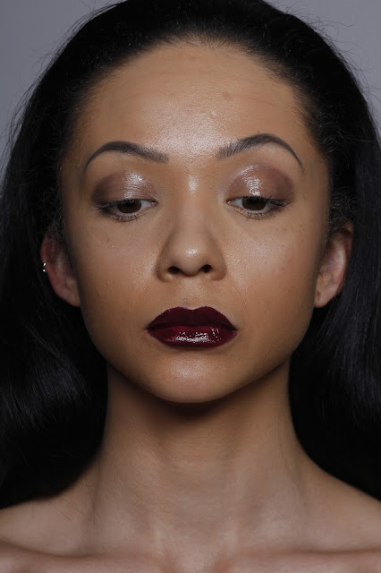
The moodboard above is a layout of inspiration for an eye and lip look that I shall be creating.  The theme behind the upcoming photoshoot will focus on glossiness, on both features.  For the lips, I want to create another dark berry lip, but this time with a more glossy texture which I plan to do by adding a clear lipgloss over the top of the lipstick colour.  For the eyes, I want to create a brown/nude colour and then I want to add vaseline over the top to create another glossy texture.  Although the glossy eye did not work very well last time, I am more confident about it for this photoshoot.  This is firstly because I am using a more neutral colour before adding gloss, and also because I will be using vaseline.  Vaseline is a softer product that will add the gloss, so I think that it will not crease and smudge as much as last time.

http://hairstyles-galaxy.com/wp-content/uploads/2015/11/slicked-back-long-hair-2016
https://uk.pinterest.com/muffinink/lipstick-lips/
http://www.urbandecay.co.uk
https://uk.pinterest.com/pin/496170083917060427/
http://www.omorovicza.com/uk/perfecting-lip-balm.html?___store=omorovicza_store_uk&___geoStore=omorovicza_store_uk


UNEDITED IMAGES


For this look, I was focusing on make-up for the eyes and lips, and I am happy with the final outcome.  I wanted to focus on glossy eye lids and lips, which I have achieved.  I chose to have a dark lip colour again to run with the classic theme of the Autumnal berry lip, but for the eyes I opted for a dark glossy nude to compliment the berry lip.  I have managed to create a crisp lip line again, which I am pleased with, and this time the glossy eyes did not crease and smudge half as much as they did in my previous photoshoot, which is good.  I have worked with the conventions of beauty to produce this set of images, by creating a look that makes both the eyes and lips stand out to the viewer.  This has been done by using a bold colour on the lips and glossy textures on both the eyes and lips.  Having the model's hair sleeked off of the face also draws more attention to the make-up.

Having no photographer available again meant that I had to shoot the images myself, which was not disastrous as  I am more confident behind the camera since the beginning of the production of this project.  I have managed to achieve clear images, however some of them are a little darker than I'd have liked, as I had trouble getting the right balance between the flash and the brightness of the image.  Therefore, in post-production I plan to increase the brightness and the levels of the images to improve the balance and the visibility of the make-up.  I will also tidy up some of the model's loose wispy hairs and make her skin look a bit smoother, by taking out the shadows from spot scars on her forehead.

Monday 18 April 2016

Still Life - Product Photoshoot


Today I shot some product imagery for my magazine, which went fairly well.  Having never done any still life photoshooting before, it was a tricky concept to grasp to begin with.  Some products produced better images than others, for example to moisturiser pot gave a clean image, whereas some of the lipstick shots were not fully focused in all areas of the image.  This is frustrating as I want the images to be perfect.

During shooting this series of images, there were a few problems that I had to overcome in order to continue the shoot and get the series complete.  Firstly, the flash would keep cutting out.  I think that this was because the bulb was overheating as someone had just done a shoot before me as well, but it meant that I had to keep turning everything off and leaving it for 10 minutes before I could continue to shoot.  This took up a lot of my time and meant that I had to skip a few of the products so that I would be finished in time for the next person to use the studio.  Another issue that I had was focusing the camera.  I had the lens set to Auto Focus, but it would not for some reason or another, meaning that I had to use Manual Focus.  This was okay at the time, however when I got home and was looking back through my images, I realised that quite a few of them were unfocused in areas of the image.

Although this was annoying, I still got some decent shots that I would be happy to use within my magazine.  When post-producing them, I will attempt to correct faults such as blurriness and brightness.

Friday 15 April 2016

Hair Photoshoot

INSPIRATION
Here is a moodboard of inspiration for the hair look that I will be creating.  For the hair photoshoot, I will be making the model's hair straight to reflect the idea of the theme behind the overall trend.  I have decided that I will take some photos of the model with her hair just straight, and then others with her hair in a low ponytail.  This is to bring a small amount of variety to the hairstyles, and to give me more to work with when it comes to creating the content of my magazine.  As well as these two styles, I wish to create some imagery of hair movement.  To do this, I will use a fan.

http://www.dadefreeman.com/blog/commercial-hair-photoshoot
http://www.foundagrave.com/grave/ruslana-korshunova/
https://s-media-cache-ak0.pinimg.com/originals/a9/4f/af/a94faf2f76ce194f24c1e42ddb7e3cf3.jpg
http://fotogallery.donnaclick.it/bellezza/153615/acconciature-per-lufficio/4/


UNEDITED IMAGES


Here are some of the unedited images from the hair photoshoot that I produced.  The aim for this shoot was to achieve an outcome that showed hair movement and sleek hairstyles to represent the idea of conformity within society.  To represent this I opted for straight hair and a low ponytail, because they are more orderly than a wavy or curled style.

I am mostly happy with the outcome of these images, although there are some areas that need improvement.  Again, some of the images seem quite dark, so they will need to be brightened in post-production.  I am happy with the hairstyles that I created and I am particularly impressed with the moving shots at the top, however there are still some out of place hairs that will need to be cleaned up in post-production.  Also, my choice of model was not best thought through.  I chose her because she has such lovely long hair, however she was slightly awkward in front of the camera and did not always follow my direction correctly.  She also has very red arms that show up as very blotchy on camera.  Had I noticed this sooner, I would have put make-up on them to correct the redness, however I did not so shall just have to try to do it in photoshop.

I think that these images represent that I have understood and worked well using beauty conventions.  The way that I have styled the hair shows this, and the hair movement images work in relation to hair adverts that are often seen on TV or in magazines.  However when creating the hair movement, we did not have a fan so we had to use bursts on the camera as the model swung her head back round to face the camera.  This took a lot of attempts to get right, however we managed it in the end.  Overall I am happy with the outcome of this photoshoot, and I think that I will be able to rectify the changes that need to be made in post-production to leave me with great images for my magazine.

Friday 1 April 2016

Skincare Photoshoot 2

INSPIRATION
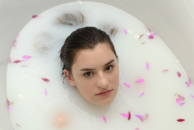
For this skincare photoshoot I want to focus on the idea of cleansing products, as opposed to how healthy your skin will look due to skincare, which is what the last shoot was focused around.  To create this effect, I will have my model in a bathtub full of milky water that will represent the cleanliness and purity of the skincare products.  For the make-up, I will create a very natural look and will use a bb cream instead of foundation, as I do not want it to smudge and rub into the bath and make the milk orange.  I will also have to consider mascara - whether to just use a clear mascara or a waterproof one.  And for the hair, I will just comb it back off of the model's face.  Whilst she will be in the bath, I will position the ends of her hair so that they sit nicely around her face to frame it, and I will try to make the hair sit on the surface of the water.

http://www.fashionstylemag.com/2015/beauty/beauty-tip-milk-bath/
https://makeurdaysfresh.wordpress.com/2014/11/23/milk-bath-benefits/
http://blog.missguided.co.uk/beauty/how-to-master-the-natural-look/
https://uk.pinterest.com/jon_howson/milk-photoshoot-inspiration/


UNEDITED IMAGES


Whilst at home for Easter, I created another photoshoot based on skincare.  This time I created the idea with my model laying in a bathtub of milky water, to represent cleansing the skin and for this series of imagery I managed to lock down a photographer for the day which I was really pleased about.  I think that if I had not of had a photographer's help, I would not have been able to produce this photoshoot because I do not have the knowledge or skill set to do photography without a studio setting.

Through using my understanding of the conventions of beauty, I was able to plan and produce this set of images to use for my online magazine. Having used minimalistic make-up and having the model in a milky bathtub shows the viewer clearly that the image is representing the idea of skincare.

Overall I am really pleased with the outcome of this photoshoot, however there are a few small things that could be tweaked in post-production.  A few of the images are a bit darker than I'd have liked to show a skincare range, so I will need to brighten a couple up.  Also the edge of the bath can be seen in a lot of the images so I will need to crop the images and blur out the edges to produce a great outcome.  Another small thing would be to clean up the areas of the face where the make-up had run slightly due to the model being in the bath for so long.